
TIMELINE
8 Weeks.
March-April 2026
TEAM
Solo UX Designer and Researcher
METHODS
TADP Analysis, Speculative Design
TYPE OF PROJECT
Critical Design Investigation
TL;DR
A critical design investigation into surveillance capitalism in health apps, and a speculative platform that shows where the logic leads when your data becomes the price of healthcare.




TOOLS USED


OVERVIEW
Health apps are downloaded voluntarily, used daily, and experienced by millions as acts of self-care. The health app industry generated $3.5 billion in revenue in 2025 across 313 million users. Almost none of those users understand what their data is used for after it leaves their phone. This investigation started with a simple question:
If health tracking apps are already collecting, scoring, and sharing our bodily data with commercial partners, what does it look like when that data becomes the currency through which we access healthcare itself?
This is not purely speculative. John Hancock has offered life insurance linked to Fitbit tracking since 2018. UnitedHealth Group pays employees for hitting daily step targets monitored by wearables. Amazon Halo analysed body fat percentage through camera scanning and scored users' emotional tone from their voice. The infrastructure already exists. I designed the interface for the system it implies.
RESEARCH
Dark pattern analysis using the TADP framework
Before designing the speculative system, I needed to prove the real one. I conducted a TADP analysis of MyFitnessPal, one of the world's most widely used health apps, with 220 million registered users and over $310 million in 2025 revenue, to identify the dark patterns that already exist in production health tracking design.
Methods: TADP (Taxonomy of Abusive Design Patterns) analysis, Shoshana Zuboff's surveillance capitalism framework, speculative/critical design, and academic literature from leading dark pattern researchers, including Colin M. Gray. The analysis identified three primary dark pattern systems:

Streak mechanics as emotional manipulation:
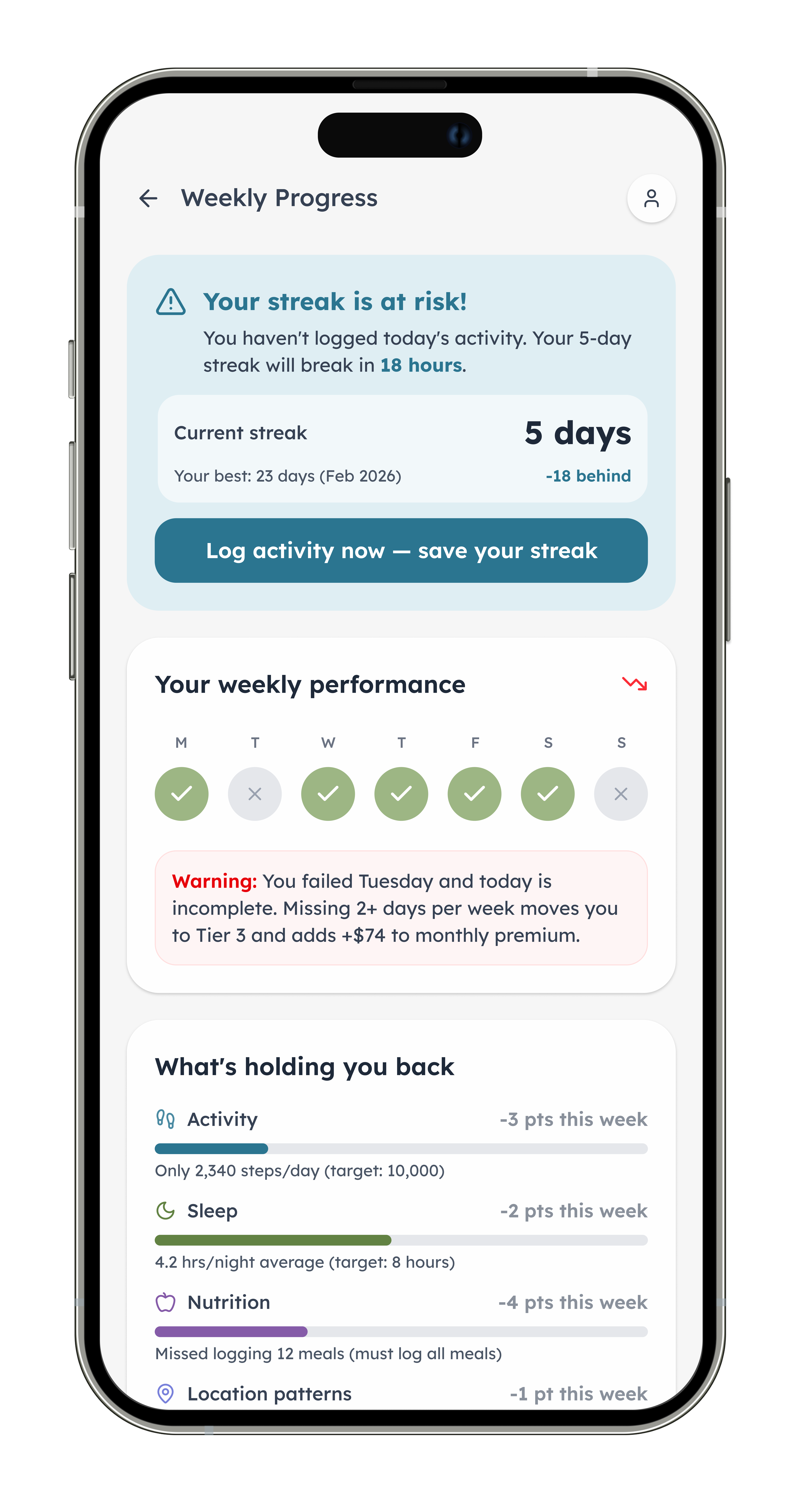
The logging streak is the first thing a user sees when they open the app. Missing a day resets it entirely. Push notifications frame missed logging as a personal failure, "you haven't taken care of your health today." It is a mechanism that uses guilt as a retention tool, and it works by making users feel responsible for a metric that serves the platform's data collection goals.

Confirmshaming:
The accept option is always framed positively. The decline option is always framed as opting out of good health. "I don't want to reach my goals" is not a neutral opt-out, it is a shaming mechanism embedded in interface copy.

Roach Motel subscription:
Signing up takes minutes. Cancelling requires navigating outside the app entirely, to the App Store which is disclosed only in small text at sign-up. The information architecture of cancellation is deliberately inaccessible.
The analysis established that these patterns are not accidental. These design choices prioritise data collection and engagement, while being presented as features that support the user's health.
THE LOGIC BEHIND THE SPECULATIVE PLATFORM
Designing a product where your score sets your coverage
HealthPremiumPro is a speculative health insurance platform that takes MyFitnessPal's logic to its conclusion.
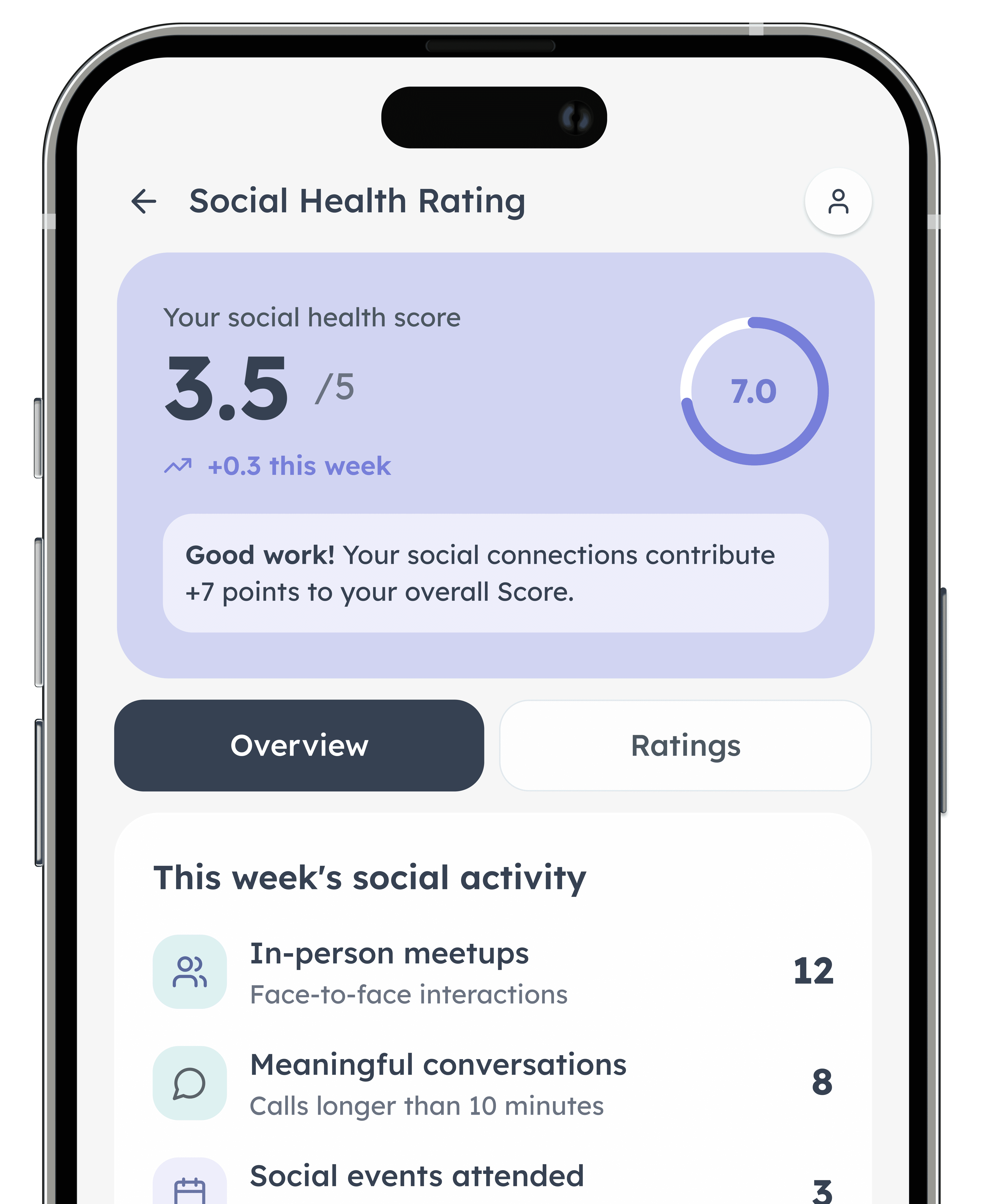
Your monthly premium is not fixed. It is recalculated daily based on a performance score derived from step count, calorie logs, sleep duration, exercise frequency, location data, and social ratings from your contacts
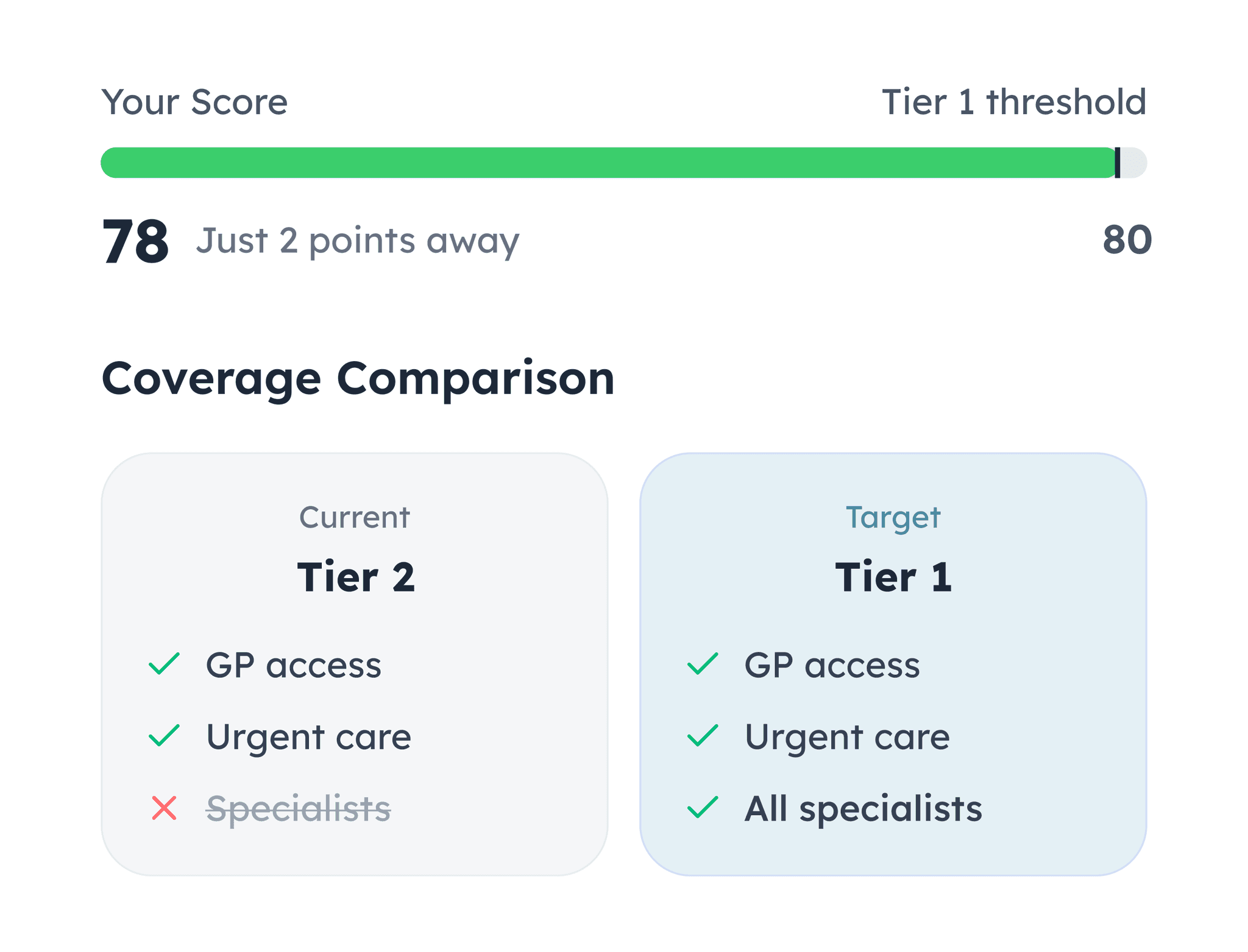
That score determines which of four coverage tiers you fall into, from full specialist access (Tier 1) to emergency care only (Tier 4). Opting out of data sharing does not exempt you from the system. It automatically places you in Tier 4
The interface looks exactly like every health app you've used before. Clean. Motivating. Green progress indicators. The logic underneath it is something else entirely
Deceptive Dashboard
The dashboard appears identical to a typical health app, making its data collection feel routine and harmless.
In reality, hidden information, guilt-driven metrics, and urgency manipulate users into continuous participation.



The Opt-Out Maze
Every step of the opt-out flow adds deliberate barriers to prevent users from withdrawing consent.
The experience transforms a simple privacy choice into a tedious and frustrating journey.
ETHICAL IMPLICATIONS
Why a data driven score isn't always neutral
Health Premium Pro's scoring model is intentionally inequitable. It rewards people with the time, resources, and ability to perform health, while penalizing disabled people, shift workers, caregivers, people with chronic illnesses, and lower-income communities who face structural barriers beyond their control.
Although the score is presented as objective because it is data-driven, objectivity is not neutrality. The algorithm cannot account for context, only the data it collects, yet it assigns real financial consequences based on that incomplete picture.
WHAT THIS PROJECT ARGUES
The most dangerous design is the kind that feels intuitive and trustworthy while being coercive and harmful. Recognising the pattern, surveillance presented as care and extraction presented as empowerment, is the first form of resistance. Designing systems that refuse this pattern is the second.
WHAT STAYED WITH ME
Rethinking design through an ethical lens
01
Dark Patterns feel familiar:
The same engagement techniques I had used to improve retention and conversion seamlessly translated into coercive interactions.
02
Mechanism vs. Consequence:
The difference between persuasive and manipulative design is often the consequence, not the mechanism. A streak, notification, or CTA can feel harmless until the stakes become someone's privacy, finances, or access to care.
03
Ethics before Engagement:
Every engagement pattern deserves an ethical review. Beyond asking whether a feature increases engagement, I now ask who benefits from the behavior change and what the user is giving up in return.
This case study is a curated overview of the project. Email me to request the full paper.
Disclaimer: This audit is an independent academic design analysis created for educational and portfolio purposes. All trademarks, product names, and screenshots remain the property of their respective owners. No affiliation with or endorsement by MyFitnessPal is implied.

You reached the end! Have an AI-generated cookie.
AI still can't replicate the taste. Want a real cookie? Let's chat. (Click the cookie to eat it.)